Iconic Logo Design

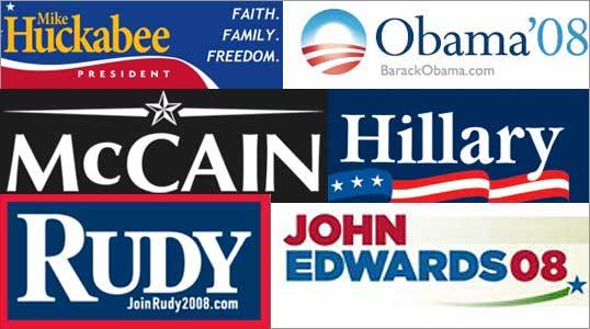
 Who knew there was such a thing as a "specialty in semiotic analysis of package design for consumer-product companies?" According to an article in this past Sunday's New York Times Magazine, there is just such a thing and what it means is that the specialist "applies the close-reading analytical skills you might associate with deconstructing a novel or a work of art to the breaking down of logos and packaging to their 'constituent parts' and 'indexical signs.'" For the article, he broke down the Tide logo in ways I would have never imagined:"...the original Tide package...communicated 'cyclone in a box,' he says. 'There's this great dynamic tension there. The word "Tide" is bursting out of the circle, and the circle is standing out of the box. It's almost a baroque composition; it's like what Steven Spielberg would do if he were designing a brand.' The idea was that Tide is a 'force of nature--it's a phase shift'...'some sophisticated color research'--involving a psychologist who specialized in such things--went into selecting a bright scheme that would suggest 'sufficient power,' tempered with the 'likable' blue that had a more 'sensitive' connotation."This article is a great reminder that good design takes a lot of research, hard work and talent to produce. Never underestimate the subliminal power of logos and design. For a timely example as we approach Super Tuesday, check out this article in the Boston Globe that breaks down the font use and logo design of each of the major candidates. Here is a sample:Clinton"The Hillary type palette is far from fresh and colorful; it is begging for legitimacy instead of demanding respect. It projects recycled establishment. The type has a tired feeling, as if the ink has been soaking into the page too long. The Hillary logo has the look of an '80s newspaper layout or an investment company. The tall lower-case reminds me of someone with their pants pulled up too high. I wonder about the significance of the three stars and three stripes. A third term?"Obama"Obama's type is contemporary, fresh, very polished and professional. The serifs are sharp and pointed; clean pen strokes evoke a well-pressed Armani suit. The ever-present rising sun logo has the feeling of a hot new Internet company. His sans serifs conjure up the clean look of